
Brand Experience · E-commerce · Packaging · Italian Food · Brand art direction · Editorial web design
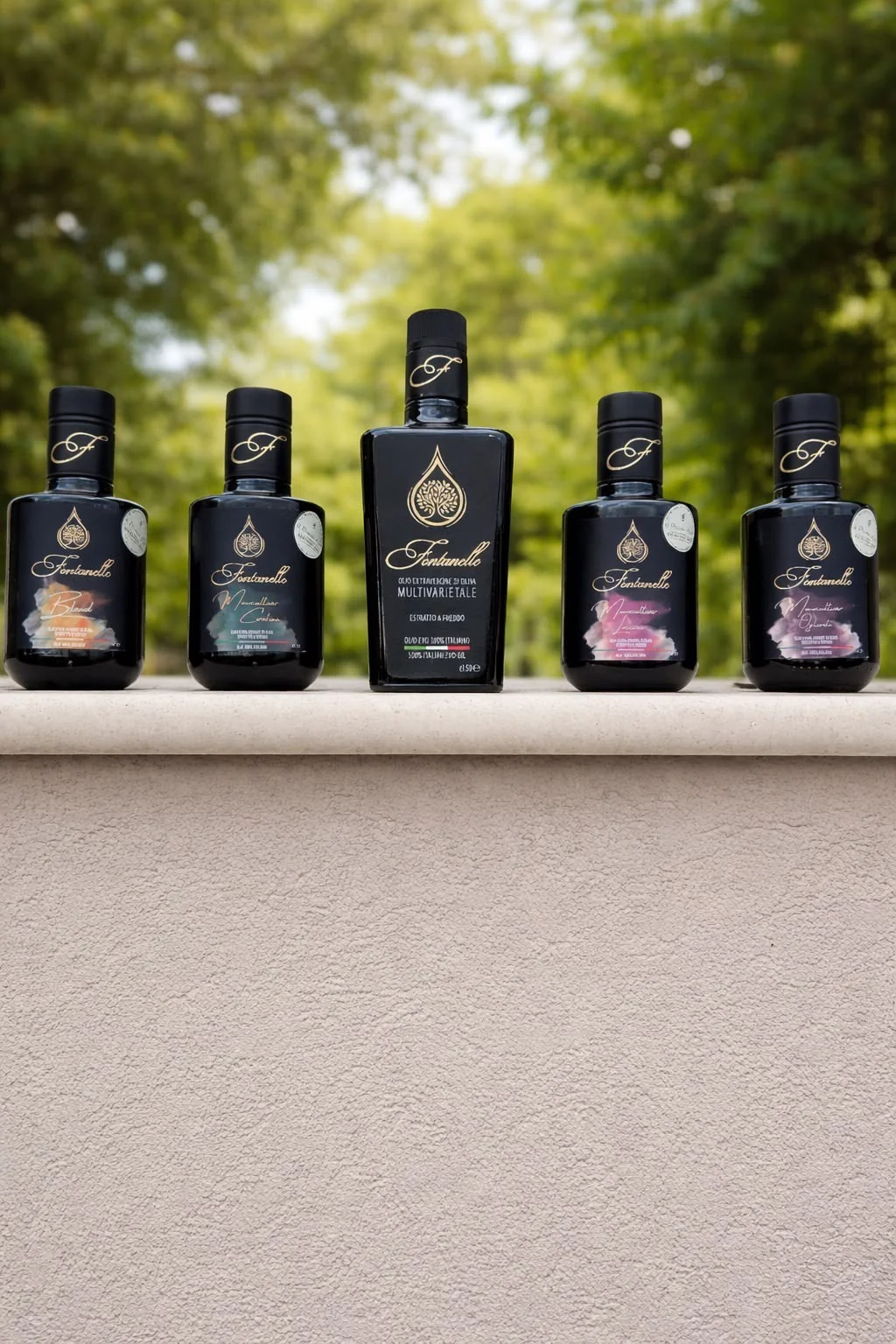
Olio Fontanelle — Make the olive oil unforgettable.
A product-led digital home for a family olive-oil estate, connecting heritage storytelling, a distinctive shop and an end-to-end checkout journey.
Year
2026
Industry
Food & drink / Olive oil
Services
Brand art direction, Editorial web design
Platform
Direct-to-customer e-commerce
01 / The brief
Put the product first without losing the provenance.
An estate brand needs to communicate provenance and quality without burying the product beneath its history. The experience also has practical commerce rules: bottle formats, mixed cases, larger containers, shipping and secure payment.
Brand art direction
Editorial web design
Product photography integration
E-commerce development
02 / Brand identity
A visual language people remember.
The visual system follows the live Fontanelle source: clean white and pale sage, deep olive green, logo gold and Bodoni Moda for editorial presence. The actual olive oil and estate photography, rather than generic imagery, drive the presentation.
Passione estratta a freddo.
Typography
Aa
Bodoni Moda
Aa
DM Sans
Colour palette
Olive ink
#1F3B2D
Estate gold
#B58A3A
Pure white
#FFFFFF
Pale sage
#F3F6F0
03 / What we built
A shopping experience rooted in the estate.
Honeysuckles designed and developed the responsive storefront, product detail and basket journeys, quantity and mixed-case logic, payment screens, Stripe integration, shipping workflow and operational order-notification integration. Source photography and identity assets from the actual estate were used throughout.
Brand
- Brand art direction
- Editorial web design
- Product photography integration
Experience
- E-commerce development
- Product configuration
- Checkout UX
Platform
- Payment integration
- Shipping setup
- Order communications
Our thinking
The strategy behind the experience.
We built the experience around the product first — oil, bottles, pouring and harvest imagery — with the family story, production and awards unfolding around it. Editorial Bodoni typography, deep olive green and restrained gold make the shop feel like an extension of the estate, not a generic checkout template.
The experience
Designed for real use.
A closer look at the details, interactions and moments that make the project feel complete.

The outcome
A cohesive, client-demonstrable commerce experience with the product at the centre, structured purchase rules, shipping and Stripe checkout in place. Sender-domain verification for transactional emails remains a separate go-live requirement.
500ml / 5L
Product formats
Mix & match
Case ordering rules
Stripe
Integrated checkout
Your turn
Have something you want to build?
Tell us where you are now, what you want to create and what needs to work better. We’ll help shape the rest.